When I started thinking about what to do for Digitarum's cover, I had all of these things in mind. This made the process of planning out a compelling design even more intimidating and it was unclear as to whether I should go for something really busy or favor a more basic design.
While they might not look like much on their own, a well planned design starts with a REALLY rough and unattractive sketch. The first shows off a more elaborate plan that would involve a shot of the tower of the gods along with the village of Taran and an expansive landscape in the distance. The next two sport much simpler designs. The image of the primordial egg on it's platform didn't feel like it would have enough to attract the eye and the image with the tower threatened to turn into the sort of overly cluttered environmental scenes which a lot of science fiction novels seem to go with. The third design felt like the best blend of intriguing, yet clean. There isn't a ton going on it in, but what is there felt a lot more interesting. This seemed like a better representation of the novel itself because it was important to me that the cover be attractive, but not oversell the story as something grander than it actually was.


With the design picked, it was time for an enhanced version of it to be constructed. This involved blocking out the principle figure of the piece - that being the silhouette of Yeb. I also played around with different fonts and font colors. Because the main background would be nothing more than a solid color, I needed to make sure I had thick enough lettering in order to make something really flashy out of it.

Once satisfied with the preliminary components and positioning, it was time to begin layering on some detail. This started with painting over the letters to create a sense of density. I also added in some lighting effects on the i's and creating an early iteration of the disintegration effect on the other side of the title. While it might seem like there is an awful lot of blue here, I had it envisioned to add in a bit more color variation with the whites so as to make it all more distinct.

Here is the early stages of layering detail on top of the character. I slowly rendered the musculature and facial details through painting on different values and blending them together. This was a fairly lengthy process, especially on the face, but the results were pretty decent. I knew all along that I would be adding in some broader light and shadow strokes with an airbrush, so I left the lighting alone once I was pleased with the results. I wanted to flesh out the entirety since I wanted some flexibility with how I positioned the final light effect.
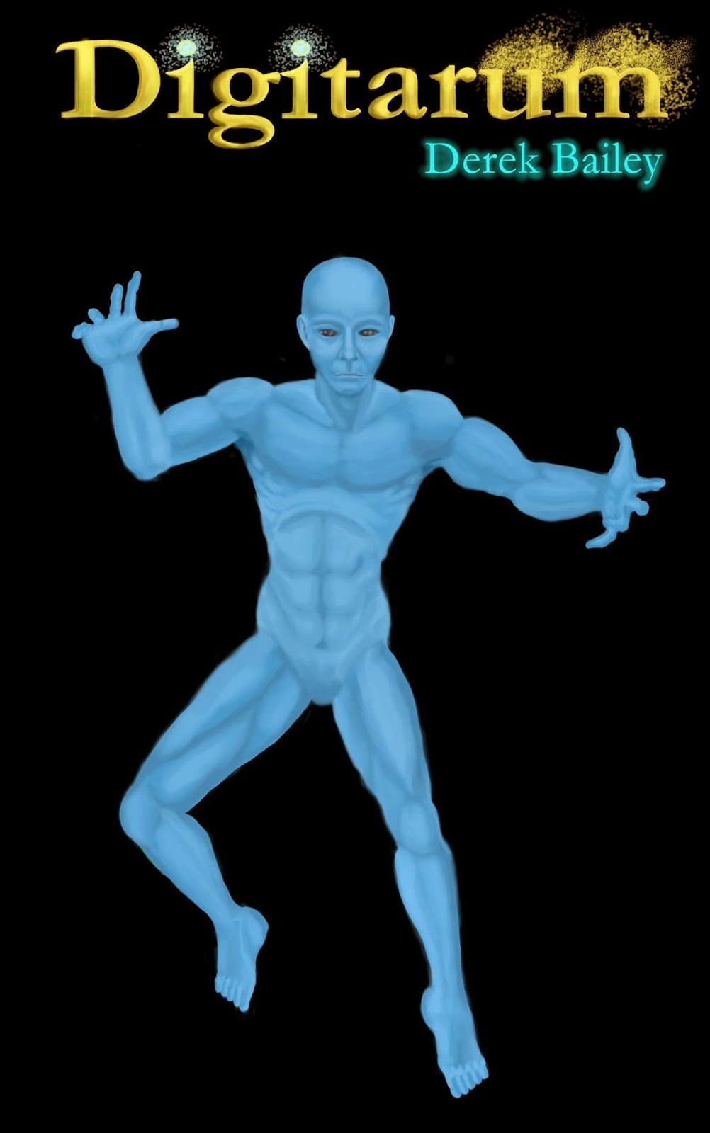
Here I added in a bit more garnish to the title. The D felt a little plain and since we read left to right, the first letter in this title really needed to stand out rather than blend in so I added some smaller details to really make it pop. I also responded to some feedback on the finer details of the body during this stage.

This where the light effect came together. It might seem like a simple element of the picture, but finding something that fit what I was going for actually took a bit of experimentation. I also made the artistic decision to break away from the way that the story describes this event. The book makes the light sound like more of a solid orb whereas the cover depicts it as being a little wispy. This is because I found that having a large blob of white in the center of my image was not only distracting, but also covered up too much of the figure that I worked so hard to define. In the end, I settled upon numerous light sources which all seem to fade off from their centers. I also added some texture by using other brushes which complimented the disintegration effect on the last two letters of the title.

Once I had all the pieces in place, I made some subtle changes. At first glance, this version probably looks the same as the one before, but there are a number of small differences like the flecks of black that I added to the last letters in the title to make it look more like they are actually being torn apart.

In the end, I have a cover image that is clean, simple, and to the point, but also interesting, much like the novel that lays beneath. It's not the best cover out there, but I have also seen much worse. It also manages to foreshadow the contents of the story, but not spoil them. The scene depicting Yeb bringing light into the world is pulled from the very first chapter and it is a fairly compelling image that readers would not have to read too far to understand the meaning of. The lights on the i's further emphasize the importance of light in the narrative and the disintegration effect is reminiscent of the polygons that all things are made from and what everything collapses apart into when it is destroyed. There are even smaller details like the checkered lines that line Yeb's body. Another more subtle reference is the vine running up the D which resembles the strange plants from the Twisted Forest.
No comments:
Post a Comment